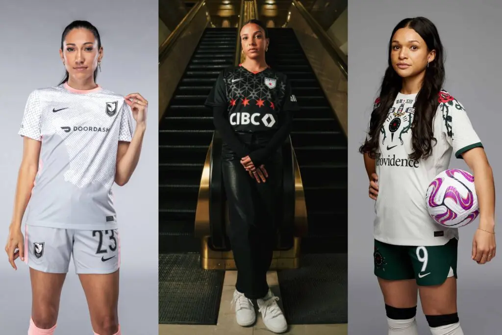
The NWSL season kicked off this weekend, and many teams debuted new kits (or new spins on their existing kits) ahead of their opening matches.
While this year’s new batch of kits display a disappointing lack of color, teams did show off intriguing (and polarizing) creative choices. But which team did it best? Just Women’s Sports lays out our 2023 kit rankings.
12. Washington Spirit
The Washington Spirit are in the process of rebranding, and that includes the team’s new kits for the 2023 season.
While the iridescent logo is cool, all-black and all-white kits leave much to be desired. And while black-and-white wardrobes are all the rage in fashion, we’ll miss the color that the Spirit always brought to the field.
The only thing that could possibly improve the Spirit’s ranking is a cherry blossom-inspired kit, which has long been a wish of editor Kate Yanchulis.
Tis the season for new #NWSL kits! A glimpse at the Washington Spirit’s 2023 jerseys, featuring a revamped crest/colors and a cool badge.
— Ella Brockway (@ellabrockway) March 1, 2023
Owner Michele Kang says this new look is the first step of the Spirit’s rebrand process. pic.twitter.com/6apRNK6Mi3
11. San Diego Wave FC
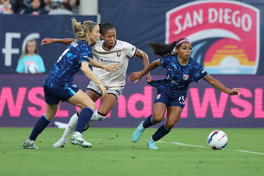
San Diego did not move up a spot in this year’s rankings simply because its new kit isn’t exactly new. The Wave have gotten rid of the detailing last year’s kit had on the sleeve and got for a straight navy home kit. The away kit is all white, which is certainly a choice.
While both kits feature cool detailing in the texture, a lack of color differentiation makes it difficult to see. Once again, the Wave failed to live up to the potential of their crest, which is disappointing as they have one of the best colorways in the league.
New threads rolling in 🌊 Introducing the 2023 Wave FC jerseys 🤝 @KPSCALnews pic.twitter.com/EX321S6KNJ
— San Diego Wave FC (@sandiegowavefc) March 6, 2023
10. North Carolina Courage
Very little has changed from last year’s kits, save for the fact that the Courage have now gone with an all-white away colorway with a “ghosted” crest that features a light blue outline. While they’re now on the very short list of colorful NWSL teams, the refresh still leaves something to be desired.
9. Houston Dash
The Dash get a point for their new Estrella Kit, which is a vibrant orange color, especially in a year when teams are turning to black-and-white colorways. But unfortunately, the orange kit doesn’t stand out as much as one might like.
The design is a bit bland, although the orange accents on black shorts are a nice touch. And while orange is the Dash’s color, it wouldn’t hurt to be a little bit more adventurous, would it?
The Houston Dash have unveiled the new La Estrella primary kit for the 2023 season.
— Just Women’s Sports (@justwsports) February 22, 2023
📸 @HoustonDash pic.twitter.com/cyY7F01YFY
8. Kansas City Current
Kansas City offered up a refresh on its secondary kit with the “Ice Kit,” which is a white jersey paired with teal shorts and socks. It’s fresh, colorful and brings something different to the NWSL lineup with the teal shorts. But the white jerseys are exactly that: white, without much added excitement.
𝙄𝘾𝙀 𝘾𝙃𝘼𝙄𝙉 🧊 𝗣𝗨𝗥𝗘 𝗪𝗔𝗧𝗘𝗥 🥶
— KC Current (@thekccurrent) March 24, 2023
Introducing our 2023 Secondary Kit 👌 pic.twitter.com/k1vnyAY5Is
7. Orlando Pride
The Orlando Pride get bumped up in this year’s rankings due to their revamp of their Luna Kit. While not a fully new kit, the numbers on the backs of the jerseys have been updated to black so that fans can more easily identify players on the field.
Also, the Pride get major prop points for changing to dark shorts to make the kits more comfortable for players during their periods. While it’s a small change, it’s a huge moment for inclusivity and accessibility. Plus, the black, gray and white look sleek.
In addition to new numbers, we will become the first NWSL team to update to dark shorts due to period concerns, continuing our investments in providing first-class player experience and care.
— Orlando Pride (@ORLPride) February 28, 2023
6. OL Reign
OL Reign revealed their new “Purpose” kit, which features two-toned blue psychedelic-style print and red accents. The change is fitting for the Reign, and it offers a refreshing update to their home kit.
Plus, the video reveal was one of the better ones we’ve seen this season.
🌶️ Purpose 🔥
— OL Reign (@OLReign) March 17, 2023
Get yours today ⤵️https://t.co/YE8RNkB7Ai#ReignSupreme pic.twitter.com/P0FDpKRqdB
5. Gotham FC
Gotham get style points simply for the fact that they didn’t reveal their new kit for this year, EA Sports did, via NWSL gameplay announcement. And while this kit maintains black elements, Gotham’s trademark Sky Blue is sprinkled throughout in a fun way.
Overall, this kit is fun and includes color – something that a lot of other kits seem to be lacking this season. Plus, we get to see Kelley O’Hara and Lynn Williams play in it. Sounds like a win.
Gotham FC has unveiled their new home kit for 2023 👀
— Just Women’s Sports (@justwsports) March 6, 2023
📸 @GothamFC pic.twitter.com/GS8c7W9NUo
4. Portland Thorns FC
What can I say? I’m a 2000s kid who was raised on Ed Hardy. You either hate this kit or you love it, and I love it. Not only does it pay homage to the Thorns and their city, but it brings something different to this year’s kit lineup.
First stop, NWSL championship. Next stop, MTV.
Bold. Unique. Undeniable.
— Portland Thorns FC (@ThornsFC) March 14, 2023
This is Portland. Introducing The Thorns ’23 kit. 🌹#BAONPDX pic.twitter.com/4UeTPEtWWg
3. Angel City FC
When considering last year’s away kit, this year’s seems decidedly less exciting. But the pops of pink help. The team once again opting to hone in on their home city of LA, this time by showcasing it on the front of the kit, is a cool touch. The Volemos on the back of the kit, accompanied by a gray to white ombré, is different from other teams’ kits.
The gray shorts to go along with the jersey isn’t the most exciting choice. Pink or black shorts might have elevated and helped to counteract the blandness of the gray color on the jersey.
Los Ángeles es más que un lugar. We are the sum of infinite parts: diverse cultures, neighborhoods, and individuals united by the city we call home. REPRESENT L.A. like never before.https://t.co/EuPwNxnoFE pic.twitter.com/vCllxHGYgl
— Angel City FC (@weareangelcity) March 16, 2023
2. Racing Louisville FC
Since their inception, Racing Louisville has not missed on a kit release. The mint kit was a joyous addition to the NWSL lineup, following home kits that were one of the best expansion kits the league has ever seen.
They once again hit the mark with the Houndstooth Kit, meant to honor Penny Chenery, the owner of Secretariat, 50 years after the colt’s Triple Crown run.
It’s fitting for Louisville, which is home to the Kentucky Derby, and is meant as a “celebration of pioneering women.” While the fleur-de-lis kit will always hold a special place amongst the NWSL kit ranks, this refresh means a lot and looks good. It also breaks up the trend of black jerseys that has plagued the league this season, with Racing opting to go all-purple with a mint logo.
A new generation of women is taking the reins.
— Racing Louisville FC (@RacingLouFC) March 22, 2023
Introducing our 2023 primary jersey, the Houndstooth Kit. pic.twitter.com/GZjxQn8XLn
1. Chicago Red Stars
The Chicago Red Stars stay winning with the kit game, releasing their new “Foundation” kit, which once again pays homage to the city of Chicago and its architecture. These might not just be the best uniforms in the NWSL, but also top the list when it comes to Chicago teams as well.
Not to mention, the kit is meant to signify the club’s new beginning as they work toward new ownership.
“The stars represent the bedrock of the foundational framework being laid as we prepare to enter a new chapter for the club,” the Red Stars wrote in a statement.
Other teams should take note of the ways in which the Red Stars lean into their city’s unique features. (Although, to be fair, no city does it quite like Chicago, which is probably why the Cubs’ City Connect jerseys were such a disappointment.) Home to some of the best architectural elements in the world, that the Red Stars continuously look to the skies and the city for their kit inspiration keeps them at the top of the league in this year’s rankings.
Foundation: (noun) the action of establishing an institution or organization on a permanent basis.
— Chicago Red Stars (@chicagoredstars) March 15, 2023
Introducing the “Foundation” kit. pic.twitter.com/mMHSFt4gyp


