As the NWSL season nears its halfway point, we all have one question on our minds: Which team has the freshest fit? Just Women’s Sports breaks it down with our 2022 kit rankings.
Every club but one has introduced at least one new kit this season. Those new unis join the league’s already robust roster of on-field looks, including those of NJ/NY Gotham FC, who stood pat for 2022 with the home and away kits they introduced at the start of last season.
Orlando Pride launched the Luna kit into orbit, while Racing Louisville released a newly-minted away kit of their own.
Expansion team Angel City FC started strong with a double dose of football fashion, and you can get to know the club and its captain Ali Riley on the new season of Riley’s Off the Ball podcast, which premieres Tuesday.
Where did each team land? Check out the full rankings:
12. Washington Spirit
The reigning NWSL champions, the Washington Spirit unveiled their 10th anniversary kit ahead of the season, but the look left a lot to be desired.
While the classic blue jersey looks lovely on the pitch, the commemorative kit lacks the creativity other clubs have incorporated into their designs. The star above the crest, which designates Washington’s champion status, deserves to feature on a splashier uniform.
11. San Diego Wave FC
The Wave’s inaugural kit is relatively straightforward: a solid blue top with a thumbprint design on the sleeves. Pink numbers provide a pop of color on the otherwise subdued jersey.
The expansion club’s vibrant sunset crest shows potential, but the uniform falls short of the vivid wave graphic.
Navy inspired by our ocean and a special inaugural patch in the gold of our iconic sunsets.
— San Diego Wave FC (@sandiegowavefc) May 7, 2022
Poderosa pink and swell blue make our name and number instantly recognizable. No one has ever repped colors like this.#WaveFC #NWSL pic.twitter.com/Nek0ilYRfE
10. Portland Thorns FC
The Thorns employed a minimal look for their 2022 home kits, which feature a horizontal thorn design running across the jersey. While black as the primary color brings drama, the design combined with the sponsor placement feels disjointed.
The club committed to the minimalist look for their away kits as well, just as early aughts maximalism is coming back into style. The all-white uniform, while crisp, is a bit too bare. The subtle details — an embossed Thorns FC wordmark down the sides, red and black piping on the sleeves — are admirable but are hard to make out from a distance.
9. North Carolina Courage
A subtle gradient highlights the Courage’s colors on the tops of the club’s 2022 kits. While the execution of the red-to-blue fade is impressive, the shading is not the most cutting-edge choice.
"To be, rather than to seem."
— NC Courage (@TheNCCourage) March 10, 2022
Yours is waiting: https://t.co/Fl940aJEKq#CourageUnitesUs pic.twitter.com/ZexIKoog1q
8. Orlando Pride
Orlando’s primary jersey, released last season, features an arresting purple and black celestial design.
The Pride’s Luna kit continues the space motif but doesn’t reach the same heights. The graphic element — a depiction of the moon’s surface — is compelling, and the commitment to the Ad Astra theme is commendable, but the primarily white jersey combined with the grey numbers leaves the back of the kit hard to read on the pitch.
Rocking it. 🏹 #LunaKit pic.twitter.com/cuqNjoa0V9
— Orlando Pride (@ORLPride) April 21, 2022
7. Kansas City Current
Kansas City’s new Electric away kit isn’t as charged as the name would have you believe. While the teal accents on the primarily white jersey are an inspired choice, the top needs more color than the side paneling offers. The club also opted to pair the top with white shorts and teal socks when the uniform would benefit from red or teal shorts to really stand out.
The club’s red primary kits are emblazoned with teal piping for an eye-catching look. The red shorts, though, feature not teal but white piping down the sides, a baffling and mismatched choice.
Teal takes center stage.
— KC Current (@thekccurrent) April 26, 2022
⚡️ The Electric Kit ⚡️ pic.twitter.com/PN4iEXgMGu
6. NJ/NY Gotham FC
Gotham FC kept their designs from 2021, with a solid black look bisected by a light blue diagonal sash for their home matches. The pattern is unlike any other in the NWSL as the club elevates a classic soccer uniform configuration.
Gotham FC’s away kits employ the same motif on white jerseys, with the blue accent popping on the minimalist look.
Bonus points for the Statue of Liberty crest!
5. Houston Dash
The Dash get an A for creativity, opting for a daring interpretation of Houston’s flag for their City of Fútbol alternate kit. Stars adorn the front of the jersey, embellished with a wavefront pattern that evokes a retro feel. Perhaps the kits are a bit too busy, but they make a splash.
Houston opted to keep a classic orange kit for home matches, a look that has become undeniably associated with the Dash.
Happy Friday Houston 😁#HoldItDown x #CityofFútbol pic.twitter.com/draU0145as
— Houston Dash (@HoustonDash) April 8, 2022
4. Chicago Red Stars
The Red Stars honor their city, the birthplace of the skyscraper, with their new kits. Adorned with a geometric blue pattern, the mostly-white jersey is inspired by the city’s skyline.
The four red stars on the jersey’s shoulders bring together the harmonious uniform, balancing out the contained front graphic.
Introducing “Skyscraper”, our official 2022 Kit. Chicago is the birthplace of the skyscraper, and this year's design captures the strength and essence of the Windy City’s powerful skyline. Pre-order yours today. The sky is not the limit, it’s just our view. #MKOT pic.twitter.com/fqm1M3JdGu
— Chicago Red Stars (@chicagoredstars) April 29, 2022
3. OL Reign
OL Reign’s 2022 Honor kit is a classic look with an intentional twist.
White with a blue and red vertical stripe, the kit features the names of Reign players who have represented the team since its debut in 2013. The sponsor logo and player names are meticulously placed, ensuring aesthetic balance, while the tribute adds a palpable weight to the uniform.
The 2022 OL Reign Honor Kit, a tribute to the past and a 🔥 look into the future -
— OL Reign (@OLReign) April 13, 2022
🛍️💧https://t.co/cbBiWKJE9K#BoldTogether pic.twitter.com/BywnOFGt0Z
2. Racing Louisville FC
Racing Louisville’s Mint kit is a breath of fresh air, providing the league with a welcome burst of color. While the kit could do with even more mint, the fleur de lis printed top is complemented well by the solid mint shorts. The club’s purple accents tie the pastel uniform together.
Louisville opted to keep their striking 2021 home kit, a black jersey emblazoned with purple flowers.
It’s in the details. 🤌 pic.twitter.com/A7Doh4kksD
— Racing Louisville FC (@RacingLouFC) April 29, 2022
1. Angel City FC
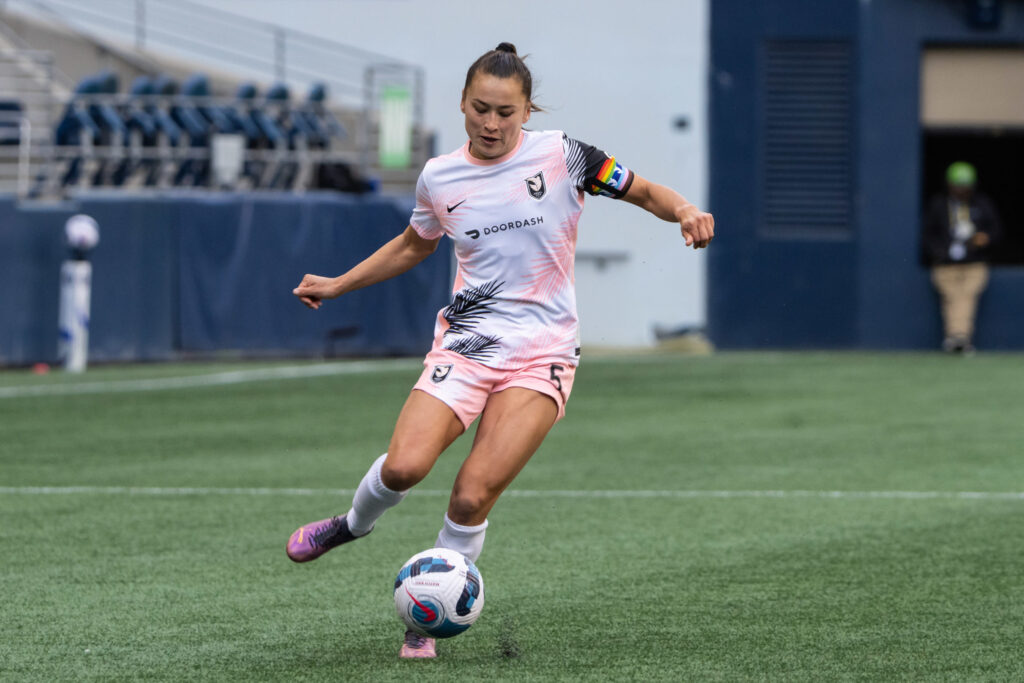
Sol rosa palm trees: Does any more need to be said? The large pink and black print across the away kit is a daring choice for an NWSL club, and it pays off.
In the same vein as the Mint jersey, the top could be elevated with even more color — but that could come in due time for the new club. The solid pink shorts are a welcome addition to the playful away uniform, pulling together the exuberant kit.
The club’s home jersey, while more understated, features an art deco pattern that solidifies ACFC as the fashion leaders of the league.
.@weareangelcity has unveiled their inaugural away kit dubbed “Daylight” - paying homage to the style of LA from the concrete to the coast. 🔥
— Just Women’s Sports (@justwsports) April 2, 2022
The club will wear these kits in today’s match against San Diego Wave FC at 1pm PT/4pm ET on CBS. pic.twitter.com/X8rdhXjBPD
