The Premier Hockey Federation’s Montreal expansion team announced its name Tuesday, introducing itself as the Montreal Force.
Also unveiled were the team’s logo and jerseys for the upcoming 2022-23 season.
Introducing the Montreal Force ⚜️
— PHF (@PHF) August 30, 2022
Accueillons la Force de Montréal ⚜️https://t.co/XvNptQRK8K pic.twitter.com/acLXpdWD2e
The name, according to the team’s news release, is meant to be symbolic of the facets of its identity: strong character, impactful presence in their community, and fierceness on the ice.
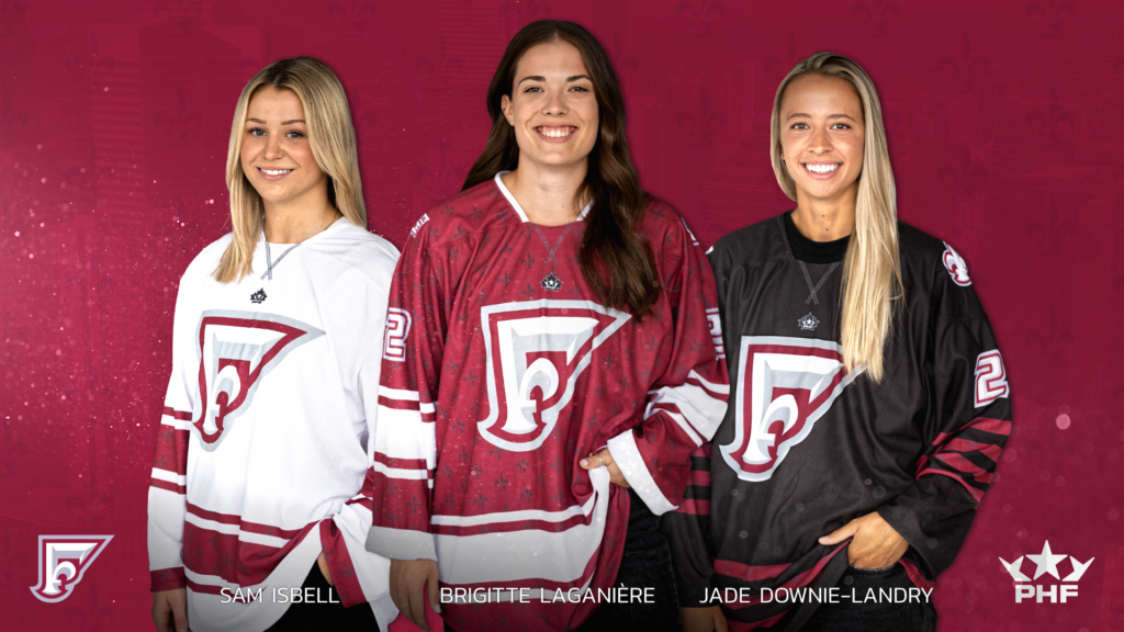
The team colors are maroon, black and white, with a logo in the shape of the letter F, which features a fleur-de-lis embedded in the crest.
“We wanted a powerful name to distinguish ourselves in this amazing hockey market and represent who we are across the women’s sports landscape,” team president Kevin Raphael said. “We are a force, both on and off the ice, with strong and confident women who will showcase their strength in all facets from competition to community involvement.
“We are a family of difference makers and role models who will make our province proud.”
There will be three different uniform sets, one white, one red and one black. The symbol of Quebec will feature on one sleeve, while a Montreal Force wordmark will decorate the other. The logo was designed by Lucas Daitchman and Brendan Poe.
While they have yet to announce the sites of their home games, the Force did announce Tuesday that Montreal, Gatineau, Québec, Rimouski, Riviere-du-Loup, Saint Jerome and Sept-Iles are among those in consideration for hosting.
In total, the team has signed 16 players so far.
“Together with my teammates, we are all very excited and proud to make history as members of the Montreal Force,” forward Ann-Sophie Bettez said. “Putting the jersey on for the first time was a special feeling I will never forget. We are all very motivated for this season to showcase what we can do in the PHF and to represent Quebec while connecting with fans in communities all over the province.”